
The refreshed identity builds on the brand’s original direction rather than replacing it entirely, honouring a logo that was initially created in-house. Instead of starting from scratch, the focus was on refinement through evolution. Multiple iterations of the W-shaped snout were explored, testing different curves, stroke weights, widths, and proportions. A hands-on process of sketching, digitising, and application testing guided each adjustment, ensuring the final mark retains its original spirit while achieving greater clarity, balance, and consistency across various touch-points.

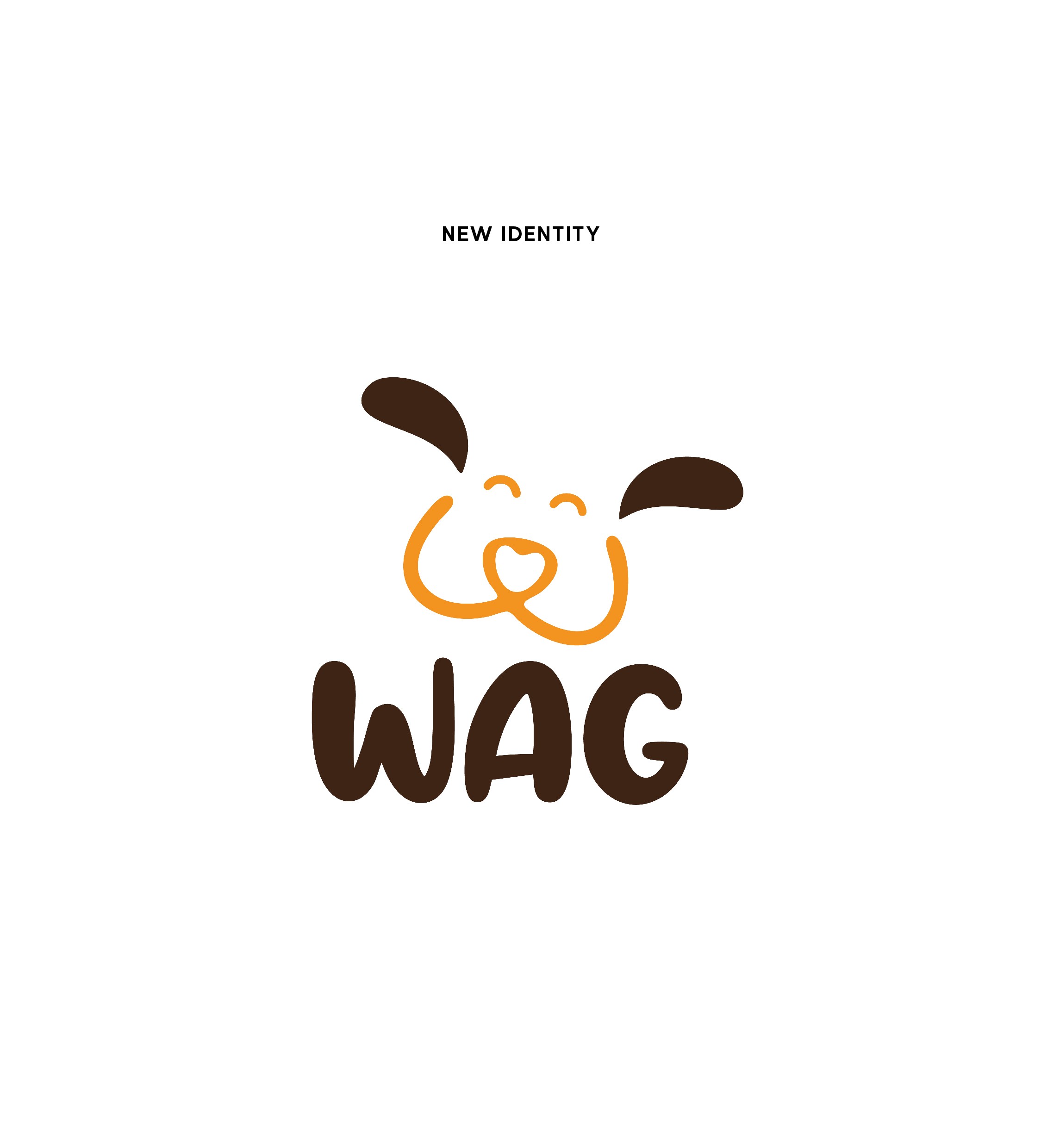
The introduction of more curves helps retain a sense of friendliness while preserving the distinctive “w” that resembles a snout. The flappy ears give it movement and life, while the gentle head tilt captures that unmistakable puppy-like curiosity, like the moment they hear a treat bag crinkle or suspect its time for a walk. The mark is paired with a thoughtfully selected typeface that compliments its personality.


More Work


WAG
Wag is an online store born from a passion to bring clean, healthy, and well-informed products to fur babies. It offers the convenience of same day deliveries, from kennels to kongs, toys to treats, and lotions to leashes. With plans to expand into physical stores soon, this project aimed to evolve the brand’s original homemade identity into one that feels more refined, confident, and bold, while retaining its warmth and playfulness.
Scope
Brand Identity, Redesign
Date
2022
Team
78 Design, Sarah Mokashi
Awards
MADDYS 2024 - Best Branding [Winner > Bronze]